
arcGIS Online
(2014)
This is a project I worked on that progressed from a re-skin of the existing UI, to an overhaul for arcGIS integration with the legacy platform.
Information Architecture
I started off by scrubbing the existing product, recording the structure, content and features. I identified discrepancies, redundancies and bugs as a precursor to establishing the basis of the IA model. The redundancies are what I use to identify high level groupings and opportunities for simplifying the content structure. For my documentation, I use indents to indicate the level which the information is accessed, dashes for static content and bullets for actionable items.

Flow Diagrams
As I record the content, features, etc. as well as the flows that exist within the current application. I use this as a spring board for the various interactions I establish moving forward.

Wireframes
Once the features and flows have been captured, I used wireframes for full screens and thumbnail renderings of each interaction, to be sure the business requirements have been captured within my revised structure. I can present this to the team at any given time for feedback, or validation of any presumptions I may have collected throughout my exploration.


UI Design
Moving from the wireframes, I begin to render out the UI elements. Since the interactions were defined in the phases leading up to the design, I begin to expand, and refine the interactions and overall experience through design.

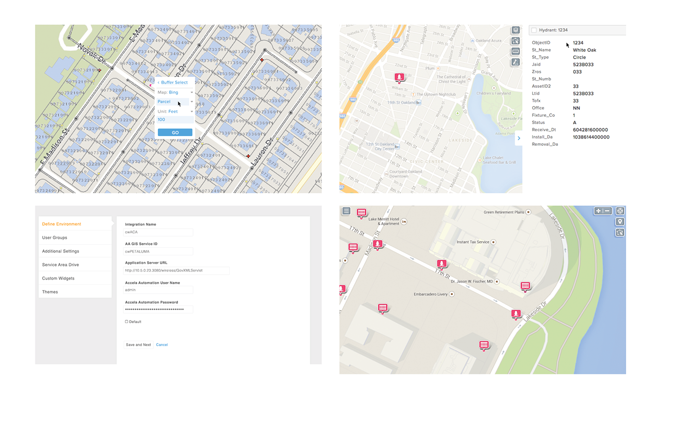
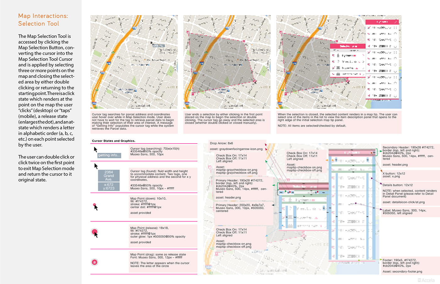
UI Specifications
Maps have so many moving parts. There are so many elements visual elements, panels that interact with map markers, fly out menus, transitional states and a ton of inter-dependencies that impact the over-all experience. Layered atop of the common complexities of map interactions is the, and a multitude of instances, that factor into sorting through the varying layers of complex geo-locational data for Discovery. It's a really complex, yet interesting challenge to take on.
Iconography
The icon set was all custom. Not that I find it to be ground breaking, or par with best practices, but the entire set was created from scratch within two working days, and converted into SVG's before going into development.

Custom Interactions
Below are animations I used to demo the intended custom interactions for the Multi-select tools and Cluster Markers. These animations were done using Photoshop, exported as animated GIF's, then uploaded to InVision for feedback and reference.
The Cluster Marker was intended to keep the user in the context of location, rather than displaying a list elsewhere in the page layout. The problem it was solving for was that, we originally had a list that extends from the right edge of the window. If there were multiple cluster markers within the map view and the list contained all records within the maps view, the context gets lost.


Thank you for taking the time to review my work. Feedback is appreciated.
Cheers.


